DEMO: Frequency domain / Effects of aliasing
This demo is prepared by Ivo Grondman a former teacher at Hogeschool Rotterdam.
Contents
Read the audio file
For this demo , we'll use the first few seconds of the song "Short Skirt, Long Jacket" by Cake. Let's start by opening up the audio file, to get a sampled signal of it in Matlab.
filename = 'shortskirt.m4a';
[y,Fs] = audioread(filename);
The variable y is a matrix of samples in which the two columns represent both stereo channels. The variable Fs contains the sampling frequency:
Fs
Fs =

       44100
For demo purposes, we only need the first 10 seconds of this song, i.e. the first 10*Fs samples
y = y(1:10*Fs,:);
Plot the frequency spectrum
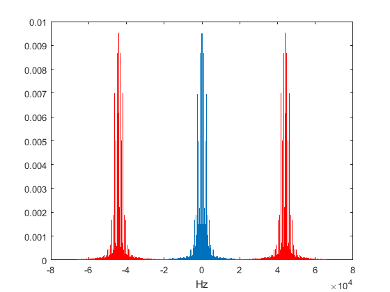
To get an idea of the frequencies present in this signal, let's plot the frequency spectrum in blue, with an alias in red on both sides. To keep the plot clean, we'll only use one channel of the signal: Generate FFT plot for original signal with 1 alias on both sides for only the left channel. (NOTE: fftplot is not a built-in command in Matlab, but a custom one taking care of both calculating the fourier transform as well as plotting the frequency spectrum)
fftplot(y(:,1),Fs,1);
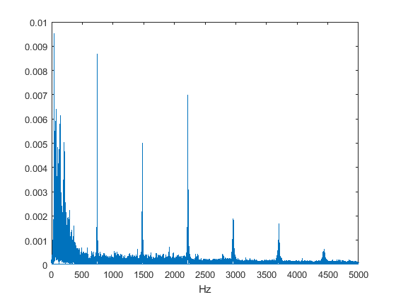
For now, zoom in on the frequencies up to 5 kHz.
xlim([0 5e3]);
A small synthesizer
The song clearly shows 740 Hz, 1480 Hz, 2220 Hz, etc. as dominant frequencies in the signal. To check what this is, let's create a signal of our own (lasting 3 seconds), containing only these frequencies:
t = 0:1/44100:3;
mysignal = zeros(size(t));
Nharmonics = 6; % Number of multiples
for k = 1:Nharmonics
    mysignal = mysignal + cos(2*pi*k*740*t);
end
You can check what our signal sounds like by using the soundsc command:
soundsc(mysignal,44100);
You'll notice that our artificially created signal sounds just like the trumpet at the beginning of the song. Indeed, we have created a cheap synthesizer!
Choosing a lower sampling frequency
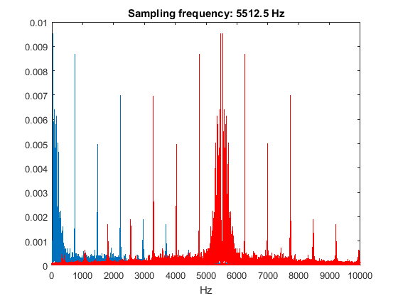
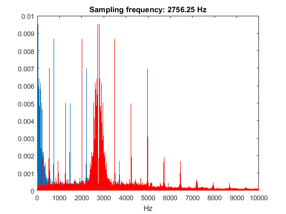
The Nyquist–Shannon sampling theorem states that we need to choose our sampling frequency at least twice as high as the highest frequency of interest in the signal, to prevent aliases from interfering with our actual signal. The following plots show how the red aliases shown in an earlier figure will overlap with our actual frequency spectrum (in blue) when we sample at 1/2, 1/4, 1/8 and 1/16 of the original sampling frequency. These plots are created by taking the original frequency spectrum calculated with a sampling frequency of 44.1 kHz and "manually" shifting the aliases to the new sampling frequency.
range = [0 10e3];
figure; fftplot(y(:,1),Fs,1,Fs/2); xlim(range);
title(['Sampling frequency: ' num2str(Fs/2) ' Hz']);
figure; fftplot(y(:,1),Fs,1,Fs/4); xlim(range);
title(['Sampling frequency: ' num2str(Fs/4) ' Hz']);
figure; fftplot(y(:,1),Fs,1,Fs/8); xlim(range);
title(['Sampling frequency: ' num2str(Fs/8) ' Hz']);
figure; fftplot(y(:,1),Fs,1,Fs/16); xlim(range);
title(['Sampling frequency: ' num2str(Fs/16) ' Hz']);
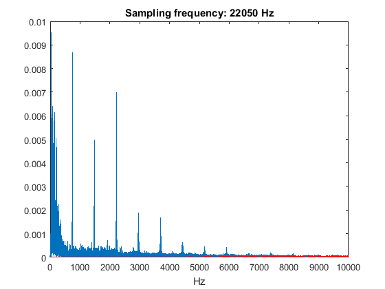
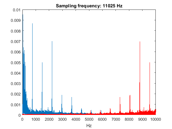

From these plots, you can expect that sampling at 22050 Hz (1/2 of the original sampling rate) will not have a big influence on the quality of the sound, whereas sampling at 2756.25 Hz (1/16 of the original sampling rate will most likely cause a mess. You can check this by downsampling the signal y and listening to the result:
% Downsample by factor 2 and listen
y2 = downsample(y,2);
soundsc(y2,round(Fs/2));

% Downsample by factor 16 and listen
y16 = downsample(y,16);
soundsc(y16,round(Fs/16));
To verify our frequency spectrum for a sampling frequency of 2756.25 Hz, we can also do a new calculation of the frequency spectrum with y16 as our starting point. This time, we will not add aliases to the spectrum manually, as these should pop up "automatically" because of the sampling frequency that was chosen way too low.
fftplot(y16(:,1),Fs/16,0); xlim(range);
title(['Sampling frequency: ' num2str(Fs/16) ' Hz']);
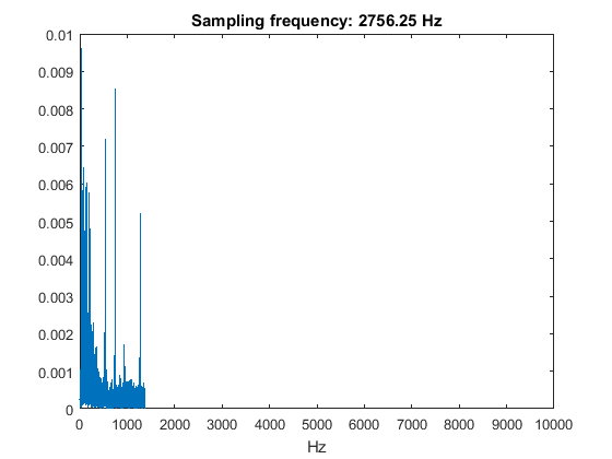
As a result of the sampling frequency of 2756.25 Hz, the spectrum can obviously only be calculated up to half that frequency. When comparing this figure to the one we created manually, it is clear that the "red alias" peaks now show up in the original spectrum that we get from our low-sampled signal.
Take another look at the first plot showing the frequency spectrum for a sampling frequency of 2756.25 Hz.
figure; fftplot(y(:,1),Fs,1,Fs/16); xlim(range);
title(['Sampling frequency: ' num2str(Fs/16) ' Hz']);
The frequencies below 500 Hz are pretty much safe from aliasing effects. If you listen to the y16 clip again, you should be able to confirm this. How?
soundsc(y16,round(Fs/16));